
Image + Text Components
28 versatile components that combine images with text for product showcases, feature highlights, testimonials, and content blocks.
Tip: These components are the workhorses of e-commerce pages. They're used for product displays, benefit sections, testimonials, and more.
Featured Layouts
Image Left + Text Right (50/50)
The most common layout for feature sections and product highlights.
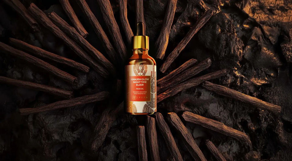
Manjish Glow Elixir Face Oil
Our bestselling face oil features rare Kashmiri Saffron and 16 Ayurvedic herbs for radiant, glowing skin. Perfect for all skin types.
- ✓ 100% Natural Ingredients
- ✓ Cruelty-Free Formula
- ✓ Visible Results in 2 Weeks
Product Card - Vertical
Standard product card layout for collection grids.
Product Name
Short description
Product Name
Short description
Product Name
Short description
Feature Block with Icon
Compact feature highlights with icons or small images.
100% Natural
Pure botanical ingredients
Cruelty Free
Never tested on animals
Sustainable
Eco-friendly packaging
Effective
Clinically proven results
Image Background + Overlay
Hero-style layout with text overlaid on image.
New Arrivals
Discover our latest collection of Ayurvedic skincare, crafted with ancient wisdom for modern beauty.
Zigzag Layout
Alternating image positions create visual rhythm.
Step 1: Cleanse
Start with clean, damp skin for best absorption.
Step 2: Apply
Massage 3-5 drops in upward circular motions.
Step 3: Glow
Wake up to radiant, nourished skin.
Common Properties
| Property | Type | Description |
|---|---|---|
| Image Position | Select | Left, Right, Top, Bottom, Background |
| Image Size Ratio | Select | 1:1, 4:3, 16:9, Custom |
| Content Alignment | Select | Top, Center, Bottom |
| Gap | Spacing | Space between image and text |
| Reverse on Mobile | Boolean | Stack order on small screens |
Responsive Behavior
Image + Text components automatically adapt to screen size:
- Desktop: Side-by-side layouts as designed
- Tablet: May reduce gap or adjust proportions
- Mobile: Stack vertically (image typically on top)
Related Components
- Image Element - Base image building block
- Basic Text - Text-only components
- Review Blocks - Testimonials with avatars
- Product Blocks - E-commerce product cards